
Graphic Design
My love for graphic design started when I was younger, where I would fiddle around on Microsoft PowerPoint creating projects for myself, my family, and my friends. Eventually during my last year of high school, I took a beginner’s class on the basics of graphic design, complete with color theory, typography, hierarchy, composition, shapes, and layout. In college I also took two other design courses, one which focused on book design and production. But a majority of what I have learned has been through trial and error and viewing the world around me. Graphic design is all about storytelling, and I love figuring out what pieces go together to tell a particular narrative.
Scroll below to view my favorite design projects, or check out my official portfolio here.
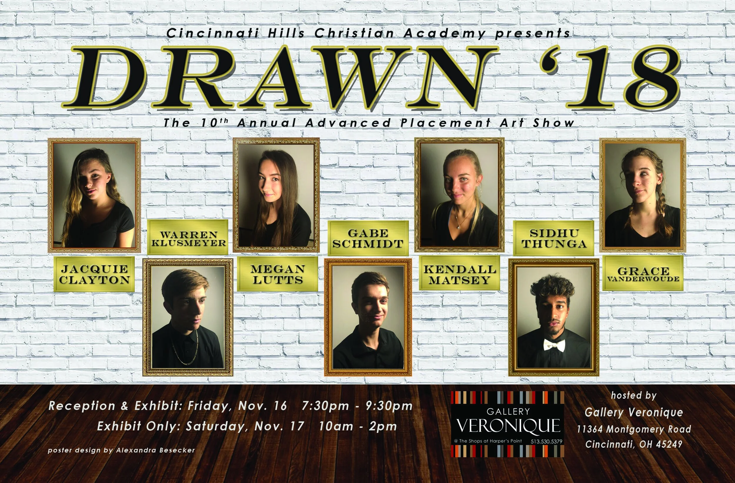
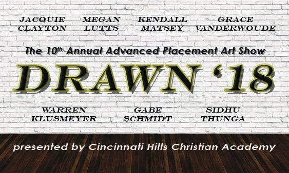
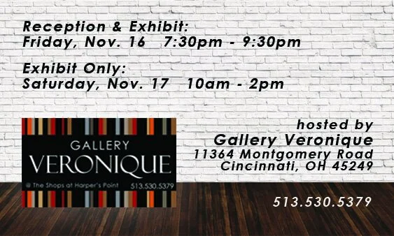
DRAWN 2018
During my senior year of high school my graphic design class held a friendly competition: who could create the most professional poster for the annual Advanced Placement art show? The winner would continue the project and craft business cards for the event. Long story short, my poster was selected by a panel of judges to advertise for the art show. After some editing, the poster was plastered around the school hallways, sent out in emails, and printed in various sporting and fine art bulletins. My inspiration for the poster was drawn from the stereotypical idea of what a museum or art show looks like, with the featured artists’ portraits as the “art” in the poster. I paired gold plaques and a stately serif font to complete the look. Five years later, this poster is still one of my favorite creations.
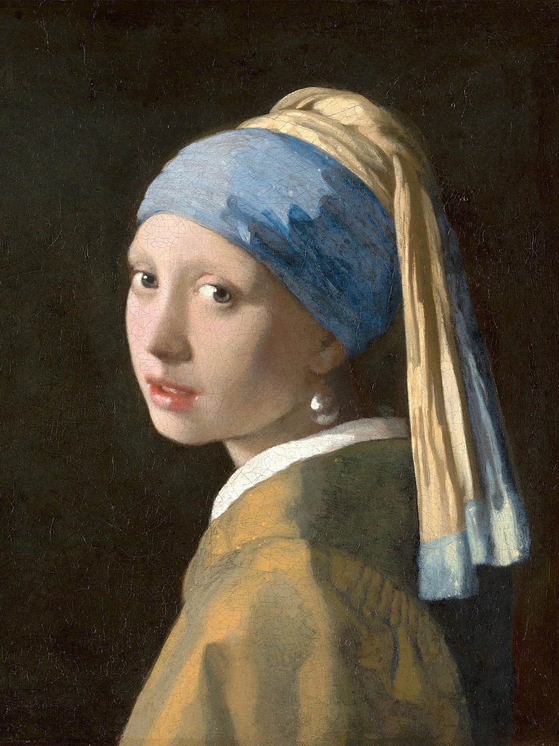
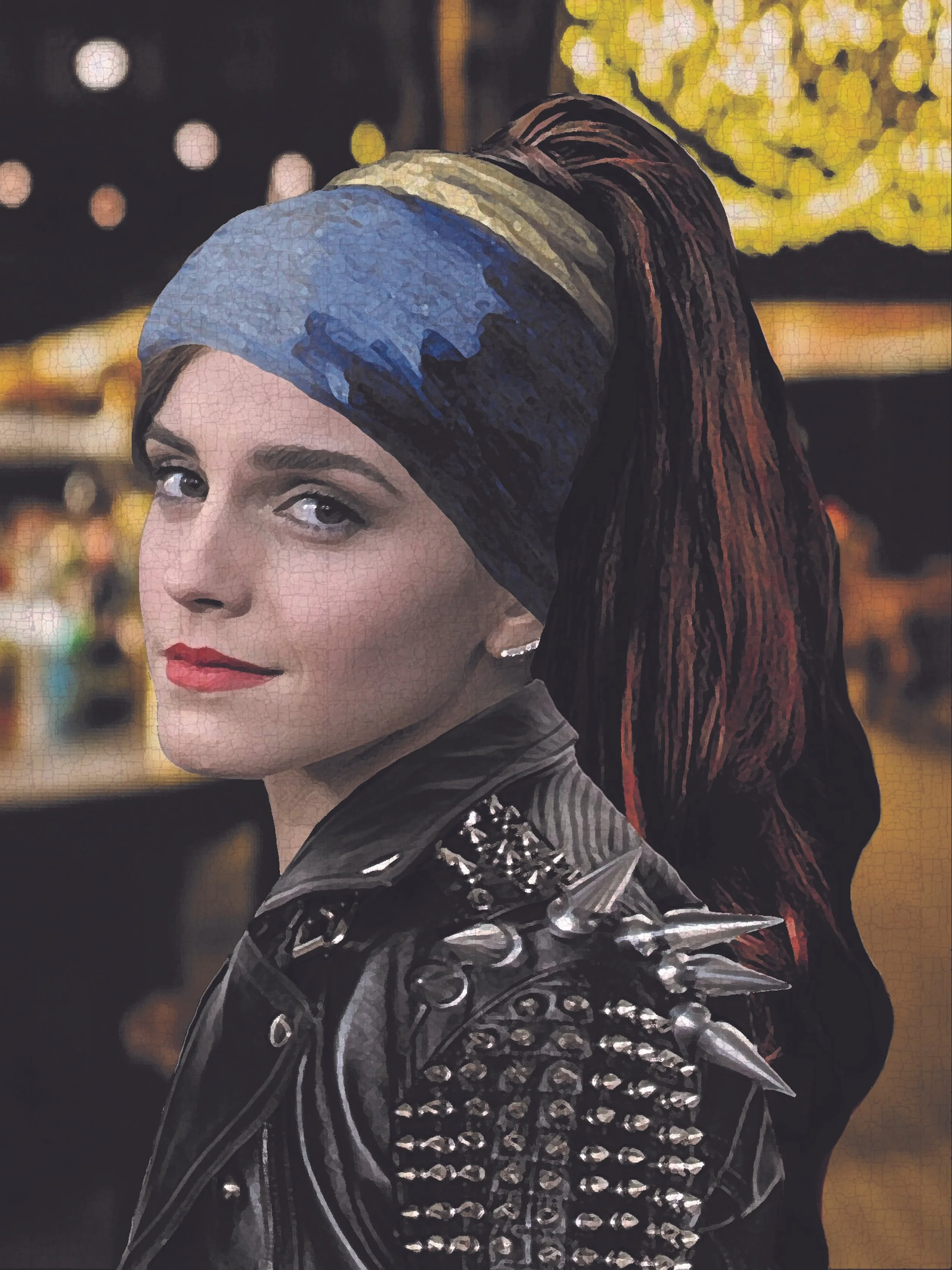
“Girl in the Leather Jacket”
This project was challenging but rewarding. My professor instructed us to “remix” a famous painting, changing almost everything in the artwork. I chose Girl with a Pearl Earring by Johannes Vermeer for many reasons: its cultural impact on society, its simplicity, its story. I wanted to create another narrative and focus on something different in my piece — the leather jacket. I spent most of my time on Google, searching for just the right model until I settled on a photo of Emma Watson. My favorite part of the process was fixing an overlay on the final product in Photoshop, so the piece mimicked the original artwork with all the miniscule cracks in the paint. Overall, I loved how this piece turned out, and it gave me the opportunity to experiment in Photoshop, as well as helped my Googling skills for when I needed something very specific!
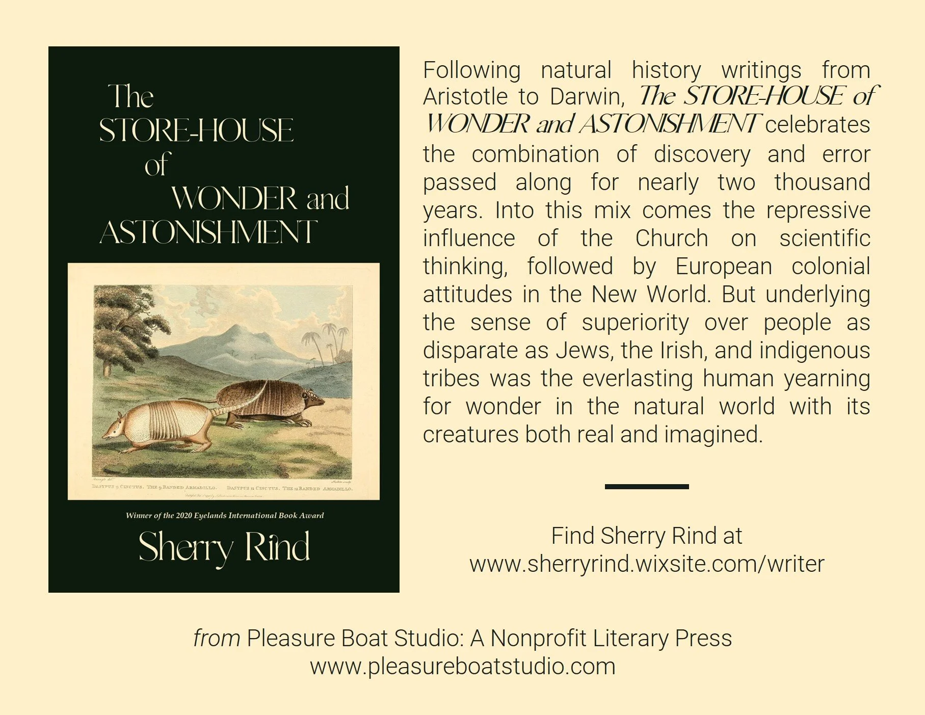
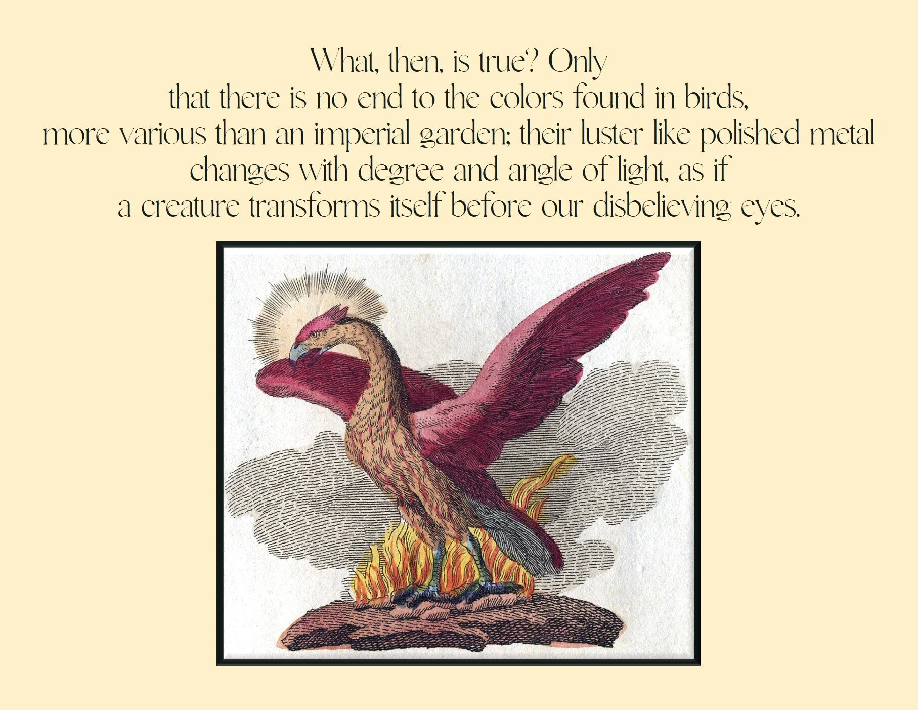
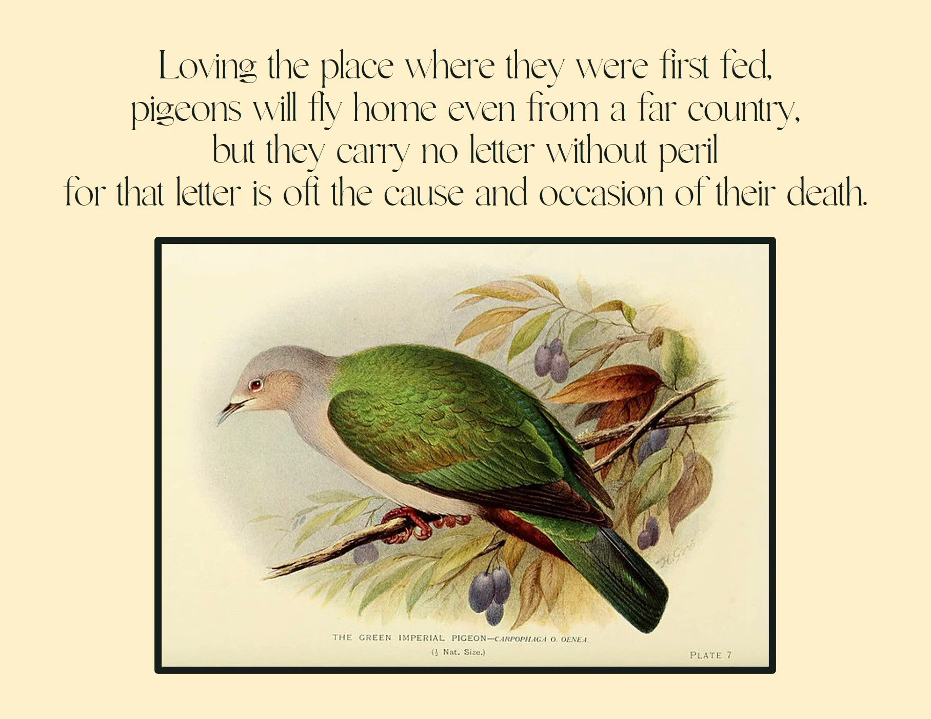
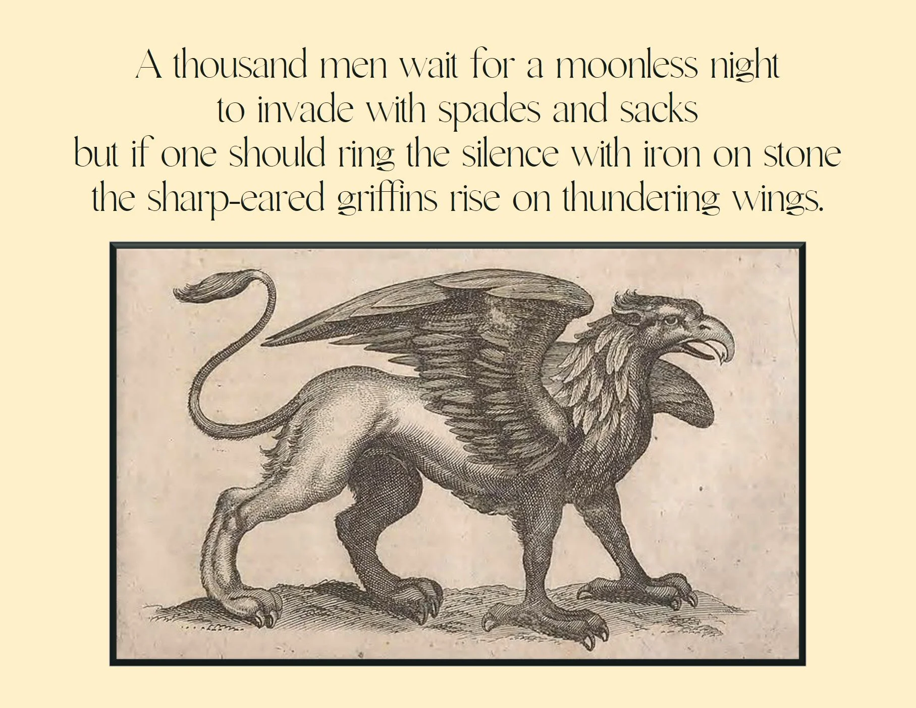
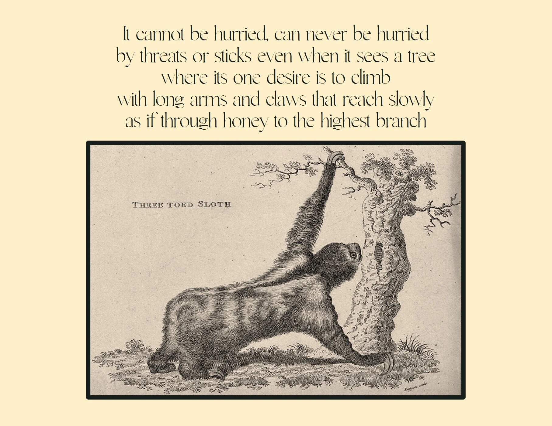
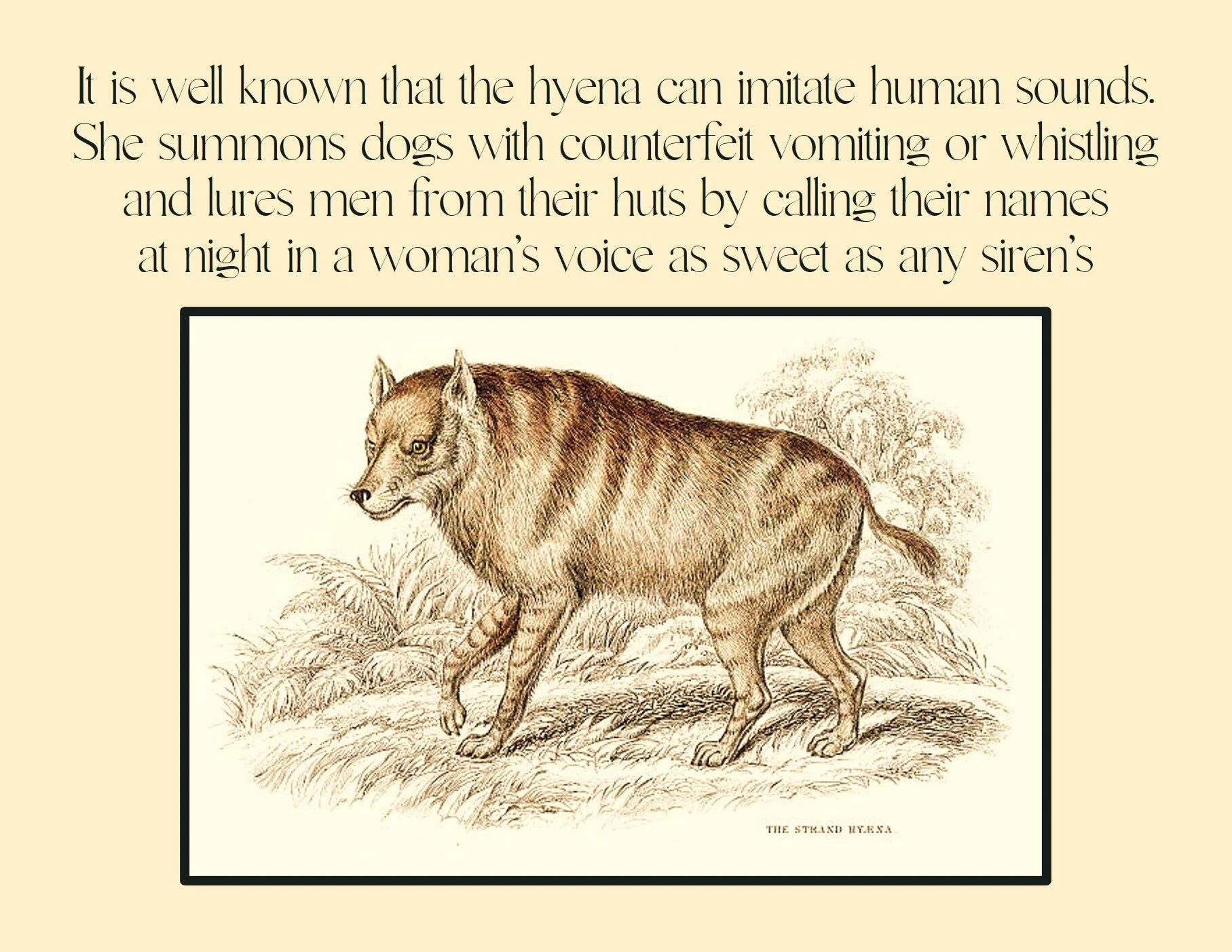
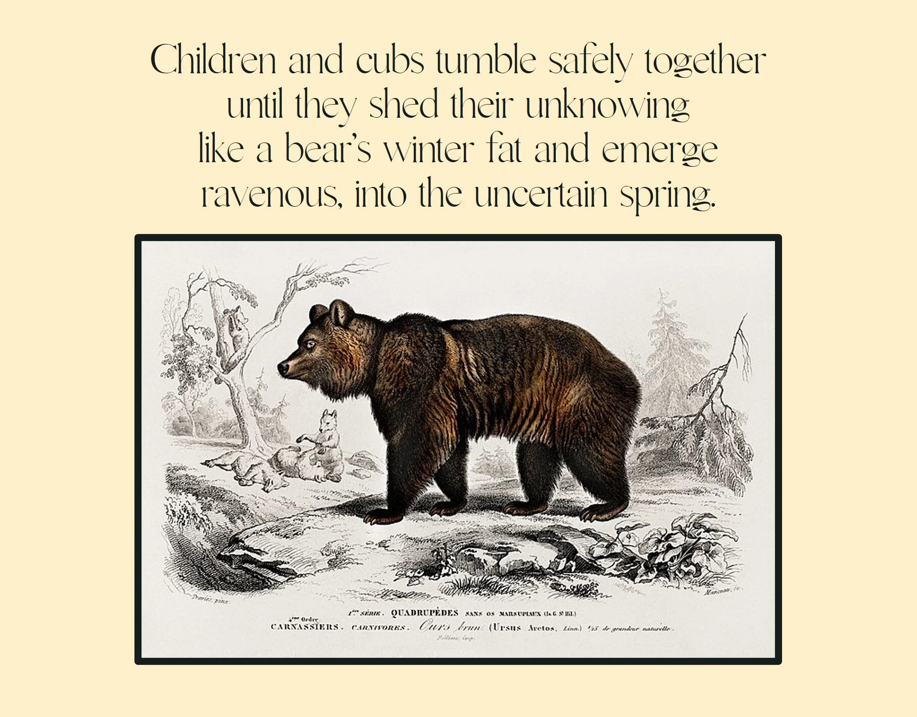
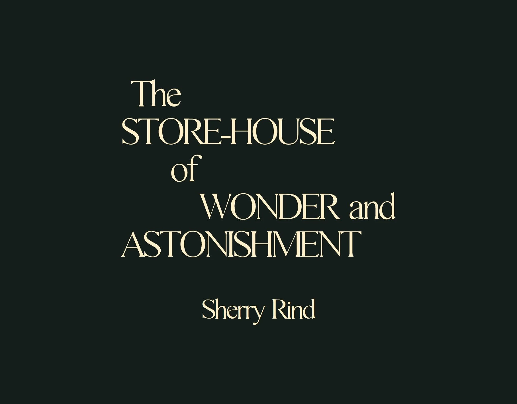
The Store-House of Wonder and Astonishment
During the summer of 2021, I was the marketing intern for Pleasure Boat Studio, an independent non-profit literary press based in Seattle, WA. One of my projects was to create a set of promotional postcards for an upcoming poetry collection: The Store-House of Wonder and Astonishment by Sherry Rind. After reading the collection, I knew that I wanted to keep the same aesthetic as the cover — the color scheme, the font, the vintage animal illustrations. I picked six different quotes before searching for matching illustrations, making sure that they fell under the Creative Commons license. Overall, this was a satisfying project to complete. The author and publisher gave me free reign over the design and trusted me to deliver polished work in a timely manner.
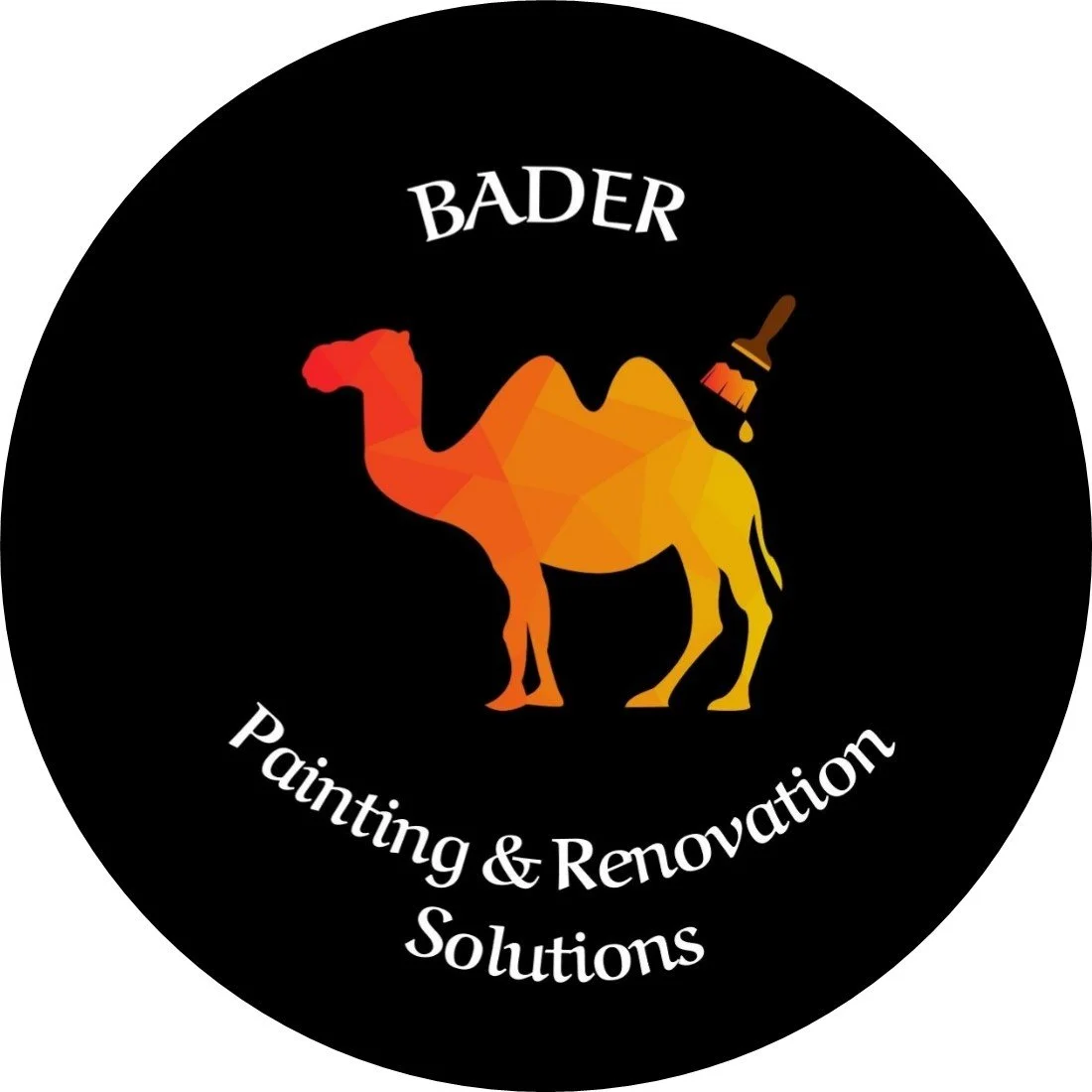
BADER Solutions
When a friend asked me to design a logo for her husband’s business, I jumped at the chance to create something rememberable. From the beginning, I already had an idea of what the logo could look like, and after some collaboration with my client, I set to work. The owner of the renovations business is a Palestinian immigrant, so I drew upon some imagery from the region: camels and a red-to-yellow gradient color scheme. While not necessarily a trend, I had seen a few logos that were geometric, and I decided to follow the same style in my design. I also added a paintbrush and drop of paint to tie together the type of business this logo was for: renovations and painting. My clients were extremely satisfied with the final logo, and I am happy that they had enough faith in me to complete this project.
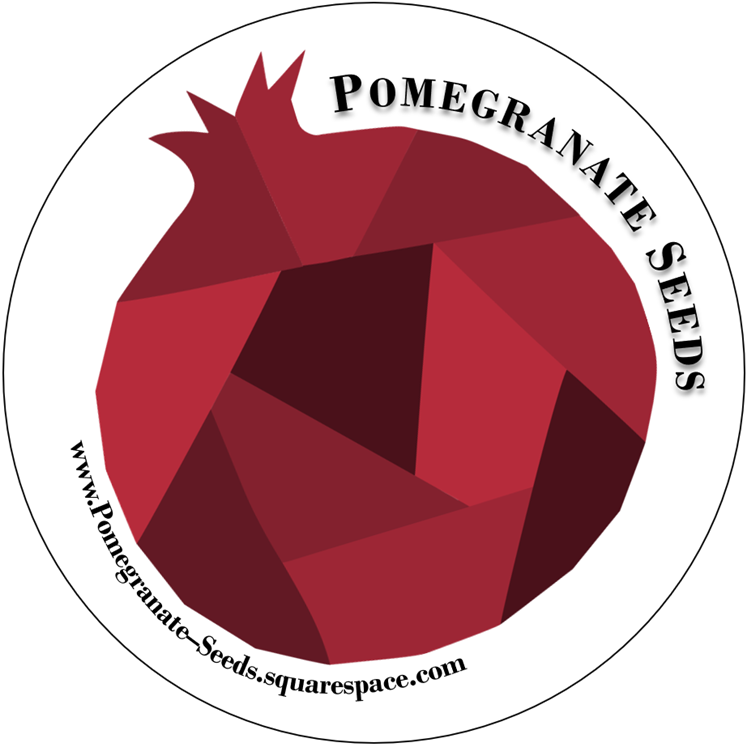
Pomegranate Seeds
Funny enough, my website was created before the logo was imagined. After launching my blog Pomegranate Seeds, I decided to craft a logo in a similar vein as the geometric camel logo for BADER Solutions. Using the same color scheme and the same font (Bodoni MT) as my website, I designed my pomegranate logo to match the brand identity I had cultivated six months prior. A simple project, I loved creating something for myself that had a true purpose. I ordered some stickers with the logo and handed them out to friends and family, as well as put the logo on my website. Who knows, maybe some more Pomegranate Seeds merchandise is on the way!
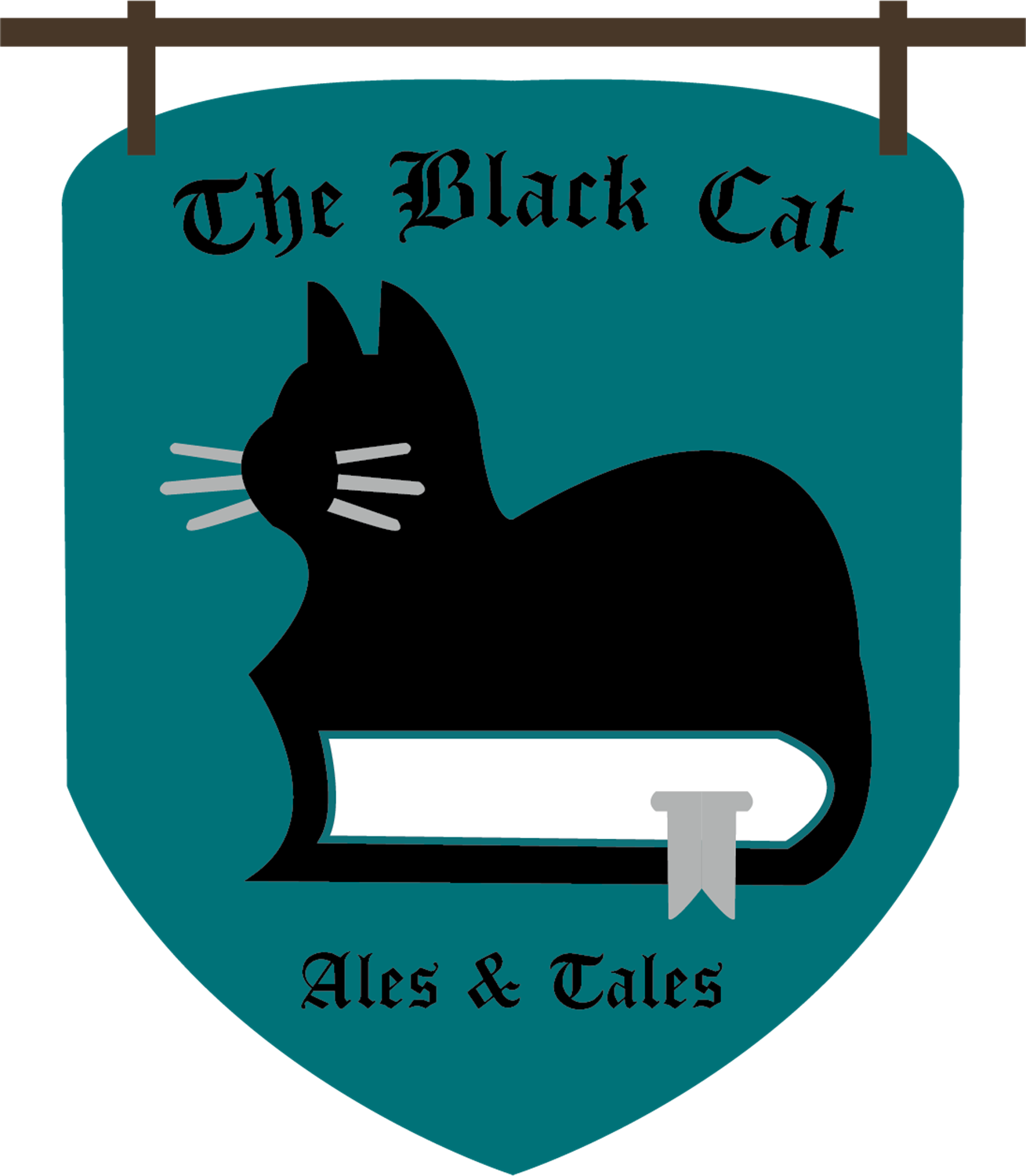
The Black Cat: Ales & Tales
While no two logos are alike, once you create a couple, the following ones you design are just a little bit easier. This logo was a class assignment where I was instructed to develop a logo for a business establishment of my own creation. Being the bibliophile that I am, I decided on a bookstore bar, where you can pair your latest book purchase with a drink of your choice — whether it be alcoholic or nonalcoholic! I was inspired by medieval tavern signs you often see in movies, both for the name of the company and the shape of the logo. Since I have a black cat of my own (her name is Bean), I decided to incorporate her into my logo. I rarely design with cool colors, so I settled on teal with complementary neutrals. A medieval gothic font completed the look; in my formal logo presentation, I added a sans serif font to balance out the decorative main font. Overall, I think this is a really cute logo, and I would love to see it on a tote bag or mug.
“Quill & Ink”
I always loved having the opportunity to work on a personal project while still obtaining class credit. During my book design course, I completed two projects: typesetting a classic novel and formatting a four-page magazine spread. “Quill & Ink” is my version of Writer’s Digest, and I placed myself as the headlining writer with a two-page interview. (Fun fact: the “author” of the interview is my mom.) While I do not have as much experience in magazine layout as I would like, this was a great exercise for me to practice my design skills. As a creative experience, I could expound on the magazine issue and write the articles that are promoted on the front cover. Overall, I enjoyed working in Adobe InDesign, and I hope that I have more opportunities to tinker around in the software. To view the magazine in PDF form, click here.
“It All Makes Scents Now”
My graphic design professor gave us an assignment to create our own zines, and I decided to combine my love of design, poetry, and perfume into one project. It is scientifically proven that smell and memory are closely linked together, and this fact fueled the idea for my zine. I wrote ten haikus, each corresponding to a particular life event or memory. Some memories already had certain fragrances attached to them, but others needed a corresponding perfume. I kept my zine simple — sometimes simplicity is better than maximalism — with large white borders, one point pairing, and a consistent layout throughout the entire zine. While the writing and design for the project were a breeze, the printing of my zine was quite a challenge; but once I held my completed zine in my hands, it was worth it. To view the full zine, click here.
Windmill:
The Hofstra Journal of Art & Literature
While my work on Windmill started as a requirement for my English degree, it quickly snowballed into a passion project of mine with a focus on legacy. After hearing a lecture on web accessibility, I was emboldened to ask my editor-in-chief if I could work on the online archive of the literary magazine. The archive was not accessible to people with screen readers, and I knew I could create something that was. Well, the creation of one webpage led to a complete overhaul of Windmill’s website. My overarching goal was to leave a workable site that was easy to navigate, pleasing to the eye, and manageable for future editorial boards. I loved working on Windmill, and I hope it brings as much joy to future editorial boards as it did to me. You can visit the website and read past issues here.
The homepage for Windmill, featuring Issue 6.
Issue 6 | 2022-2023 webpage